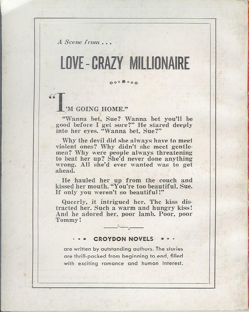
Title: Due or Die
Author: Frank Kane
Cover artist: Harry Bennett

Best things about this cover:
- It's got a lot going for it: redhead, cigarette, and alcohol all represented within about one square inch of the cover, plus fierce heels and a trench-coated dude looking on, wryly.
- I think she is a monster. Why can't we see her face? Why?
- Answer: she doesn't have one.
- Actually, I think her face is some kind of hologram projector, and Johnny Liddell standing in the doorway is the resulting image: "Help me, drunken redhead, you're my only hope."
- There is a Perma Books version of Hammett's The Glass Key that (if memory serves) looks Just like this cover. Frank Kane is no Dashiell Hammett, in case you're wondering.
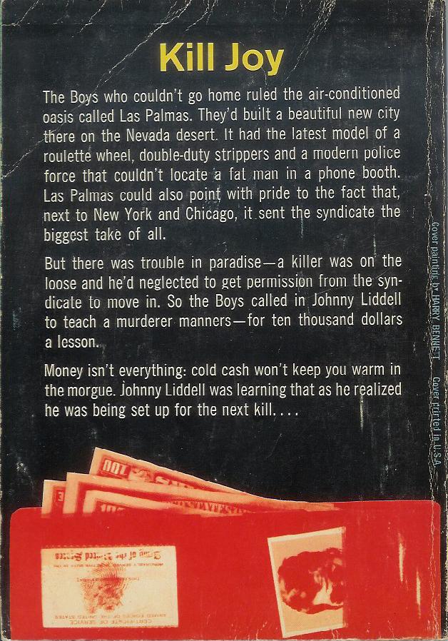
Best things about this back cover:
- "Kill Joy" - good idea. You meant Joy Behar, right?
- I like Johnny Liddell's mug just peeping out of the wallet slot.
- I also really like the line about the fat man in the phone booth. Now that's good cover copy.
RP